
A startup founder spent months perfecting his website, convinced his product would sell itself. Traffic trickled in, but conversions? Barely a whisper. Frustrated, he compared his site to a competitor’s—the difference was night and day.
Their copy spoke directly to customers, answered objections, and made clicking “Buy Now” irresistible. His? It was all about features, not benefits.
Great website copy can be the difference between visitors bouncing and buyers committing. Some brands nail it, while others unknowingly push potential customers away. This guide dives into website copywriting examples that work—and those that don’t—so you can craft words that convert instead of letting leads slip through your fingers.
Table of Contents
The Do’s and Don’ts of Homepage Copy
Your homepage is like the front door of your website—it’s the first thing visitors see, and first impressions matter. If your copy doesn’t immediately grab attention, you risk losing potential customers before they even explore what you offer.
Let’s break down what works (and what doesn’t) when crafting homepage copy that actually gets results.
AI Generated Image
✅ Do: Make Your Message Crystal Clear
Visitors should understand what your business does within seconds of landing on your homepage. If they have to scroll or decipher vague wording, they’ll likely leave. Clear messaging builds trust and keeps people engaged.
🔹 Use a strong headline – A great homepage headline instantly communicates what you do and why it matters.
🔹 Write for your audience – Speak directly to their needs, pain points, and desires, not just about your company.
🔹 Keep it simple – Avoid jargon or industry buzzwords that might confuse new visitors.
🔹 Add a supporting subheadline – This gives extra clarity and can reinforce your unique selling point.
🚀 Example of great homepage copy:
“Effortless Meal Planning for Busy Professionals – Save Time, Eat Better, and Enjoy Stress-Free Cooking”
🚫 Example of bad homepage copy:
“Innovative AI-Powered Solutions for Optimized Culinary Experiences in the Modern World”
See the difference? One is clear and relatable, while the other is vague and overly complicated.
❌ Don’t: Overload Visitors with Too Much Information
Nobody wants to read an essay on your homepage. If visitors feel overwhelmed, they’ll click away faster than you can say “bounce rate.” Your job is to guide them smoothly, not bury them in endless text.
🔻 Avoid walls of text – Break up your copy with bullet points, short paragraphs, and visuals.
🔻 Resist the urge to explain everything – Direct visitors to other pages for deeper details.
🔻 Prioritize key info – Your homepage isn’t the place for a deep company history lesson.
📝 Quick Fix: Stick to the essentials—who you are, what you do, and how visitors can take action.
| Good Homepage | Bad Homepage |
| Clear, concise copy | Long, dense paragraphs |
| Easy-to-read sections | Confusing or cluttered text |
| Focused on the user | Focused on the company |
✅ Do: Use Strong Calls-to-Action (CTAs)
A great homepage doesn’t just inform—it encourages action. Whether you want visitors to sign up, shop, or book a call, your CTA should be impossible to ignore.
🔥 Tips for better CTAs:
✔ Keep it action-oriented (e.g., “Get Started,” “Download Now,” “Try for Free”)
✔ Make it stand out with buttons, color contrast, or bold fonts
✔ Create urgency without being pushy (e.g., “Limited Spots Available!”)
💡 Example of a compelling CTA:
“Join 10,000+ Happy Readers – Subscribe Now!”
🚨 What NOT to do:
“Click Here” (Vague and uninspiring)
Your CTA should make visitors feel like they’ll miss out if they don’t take action.
❌ Don’t: Be Too Generic
Generic homepage copy makes your site blend into the background. If it sounds like every other website, visitors won’t remember you. Inject personality, be specific, and show what makes you different.
😴 Boring copy example:
“We provide top-notch services to help businesses grow.”
🌟 Engaging copy example:
“We help startups double their revenue with high-converting website copy. Ready to grow?”
The second one feels more personal, right? That’s the magic of good homepage copy!
Your homepage copy can make or break your website’s success. Keep it clear, engaging, and focused on your visitors. Nail the messaging, and you’ll turn curious clicks into loyal customers. Want more website copywriting examples? Keep reading—we’ve got plenty more insights ahead! 🚀
Why Some Product Descriptions Sell Better Than Others
Ever wondered why certain product descriptions make you hit “Add to Cart” without a second thought, while others leave you yawning? The secret isn’t just in fancy words—it’s in how those words make you feel.
A great product description does more than list features; it paints a picture, triggers emotions, and convinces you that life without this item just wouldn’t be the same.
Let’s break down what makes some product descriptions irresistible while others flop.
AI Generated Image
✅ Do: Make It About the Customer, Not Just the Product
A common mistake? Describing the product without explaining why it matters to the buyer. People don’t just buy things—they buy solutions, experiences, and emotions.
What works:
✔ Focus on benefits, not just features
✔ Speak directly to the customer (use “you” and “your”)
✔ Help them imagine how the product improves their life
🚀 Example of a winning product description:
“This ultra-soft weighted blanket hugs you to sleep, reducing stress and helping you wake up feeling refreshed and energized.”
🛑 What NOT to do:
“Made with premium cotton and filled with 15 lbs of micro glass beads.”
See the difference? One makes you feel something, while the other just lists technical details.
❌ Don’t: Overload with Technical Jargon
Unless you’re selling to industry experts, stuffing descriptions with complex terms only confuses people. Buyers want clarity, not a science lesson.
Avoid:
🔻 Overcomplicated specs (unless absolutely necessary)
🔻 Unclear abbreviations or technical terms
🔻 Robotic-sounding phrases that lack personality
| ❌ Bad Description | ✅ Better Version |
| “Features a 6-core processor and 12GB LPDDR5 RAM for optimal multitasking efficiency.” | “Fast, powerful, and built for multitasking—stream, game, or work without a single lag.” |
| “Constructed with 100% polyurethane material for durability and water resistance.” | “Built to last, this sleek, waterproof design keeps your essentials safe—rain or shine.” |
Keep it simple. Keep it engaging. Keep it human.
✅ Do: Use Sensory Language & Storytelling
Great product descriptions don’t just tell you about a product—they help you experience it. Sensory words (touch, taste, smell, sound, and sight) make descriptions more vivid and memorable.
🍫 Example (for a chocolate brand):
“Each bite of our dark chocolate melts smoothly on your tongue, balancing rich cocoa with a hint of sea salt perfection.”
🛑 What NOT to do:
“Contains 70% cocoa solids and sea salt.”
One makes your mouth water. The other? Just sounds like a food label.
❌ Don’t: Ignore Formatting & Readability
People skim when they shop online. A huge block of text is a guaranteed way to lose them.
👎 What hurts readability:
- Long paragraphs with no breaks
- Lack of bullet points for key features
- No visual elements to break up text
💡 How to fix it:
✔ Use short, punchy sentences
✔ Add bullet points for features & benefits
✔ Break up text with bold words, icons, and tables
🔹 Before:
“Our smartwatch comes with a durable silicone strap, built-in GPS, water resistance up to 50 meters, and a long battery life.”
✅ After:
Why You’ll Love It:
- ⌚ Sleek, lightweight design for all-day comfort
- 🌊 Water-resistant up to 50 meters—perfect for workouts & adventures
- 📍 Built-in GPS to track your runs with precision
- 🔋 Battery lasts up to 7 days—because who likes charging?
Which version would you rather read?
The best product descriptions sell a feeling, not just an item. They’re clear, engaging, and easy to read. Keep it customer-focused, add personality, and break up the text for a better shopping experience. Want more website copywriting examples? Stick around—there’s plenty more to learn! 🚀
About Page Copy That Builds Trust (With Examples)
When someone lands on your About page, they’re looking for more than just facts—they want a reason to trust you. A boring, corporate-sounding bio won’t cut it. Visitors want to know who you are, what you stand for, and why they should choose you over the competition.
A great About page makes people feel connected to your brand. Let’s break down what works, what doesn’t, and how to write About page copy that builds trust and keeps people engaged.
AI Generated Image
✅ Do: Tell a Story, Not Just Your Resume
Nobody wants to read a robotic list of milestones. A great About page feels like a conversation, not a corporate report. Sharing a compelling story makes your brand more relatable and memorable.
🔹 What works:
✔ Talk about why you started your business (passion, problem-solving, personal journey)
✔ Show personality—your voice should match your brand’s tone
✔ Keep it engaging and easy to read
🚀 Example of a great About page intro:
“It all started with a broken coffee maker and a desperate need for caffeine. Frustrated with cheap, unreliable machines, we set out to create a coffee experience that actually lasts. Today, BrewBetter helps coffee lovers enjoy barista-quality brews at home—without the morning chaos.”
🛑 What NOT to do:
“BrewBetter was founded in 2018 with a mission to provide high-quality coffee makers. We are committed to customer satisfaction and innovation.”
See the difference? One sparks curiosity, the other sounds like every generic brand ever.
❌ Don’t: Make It All About You
Your About page might be about you, but it’s really for your audience. Visitors don’t just care about your background—they want to know how your story benefits them.
😴 What NOT to do:
- Focus only on company history with no mention of customers
- Use too much “we” and not enough “you”
- Skip over what makes your brand unique
💡 How to shift focus:
✔ Talk about why your brand matters to the customer
✔ Show how your values align with theirs
✔ Make your audience feel like part of the journey
🔹 Before:
“We started this company in 2015 and have grown into an industry leader, winning multiple awards along the way.”
✅ After:
“For over eight years, we’ve helped 50,000+ customers find the perfect home office setup. Your workspace deserves comfort and style, and we’re here to make that happen.”
The second version makes the reader feel included, not like an outsider reading a company brochure.
✅ Do: Add Social Proof & Real Faces
People trust people—not faceless companies. Showing real team members, customer testimonials, or media mentions can make your About page feel more human and build credibility.
👥 What builds trust:
✔ Team photos and bios (with personality!)
✔ Customer reviews or success stories
✔ Press mentions, awards, or industry recognition
📌 Example:
“Our customers say it best! Over 10,000 five-star reviews prove that our skincare products really work. See why beauty experts at Vogue and Allure rave about us!”
💡 Quick tip: If you have a team, include fun, short bios with a personal touch. Example:
| Name | Role | Fun Fact |
| Sarah | Founder | Runs on coffee and dad jokes ☕😂 |
| Jake | Lead Designer | Once designed a website entirely in Comic Sans (never again) |
| Mia | Customer Support | Can solve any issue—except her addiction to online shopping 🛍️ |
Adding personality makes your brand feel approachable and real.
❌ Don’t: Write a Wall of Text
Nobody enjoys reading long, dense paragraphs. If your About page looks like a novel, visitors will skim (or worse, leave).
👎 What hurts readability:
- Huge chunks of text without breaks
- No visual elements (images, lists, bold text)
- Overcomplicated sentences
✔ Make it scannable with:
- Short paragraphs
- Bullet points for key info
- Bold or italicized text to highlight important details
🔹 Before (hard to read):
“At [Brand Name], we pride ourselves on our dedication to excellence, customer satisfaction, and industry-leading innovation. Since our inception, we have worked tirelessly to provide unparalleled service, ensuring every client receives the highest quality solutions available in today’s market.”
✅ After (easy to scan):
✔ 10+ years of experience in digital marketing
✔ Featured in Forbes, Business Insider & TechCrunch
✔ Helping startups grow from zero to hero 🚀
Which one grabs your attention faster?
A well-crafted About page isn’t just a formality—it’s a trust-building powerhouse. Keep it personal, focus on your audience, and make it easy to read. Want more website copywriting examples? Keep scrolling—we’ve got plenty more insights ahead! 🚀
Landing Pages That Convert vs. Those That Don’t
Landing pages have one job—to convert visitors into action-takers. Whether it’s signing up, buying, or booking a call, a well-optimized landing page guides users smoothly to that next step.
But not all landing pages are created equal. Some grab attention, spark interest, and drive action. Others? They confuse, overwhelm, and send people running for the exit. Let’s break down what makes the difference.
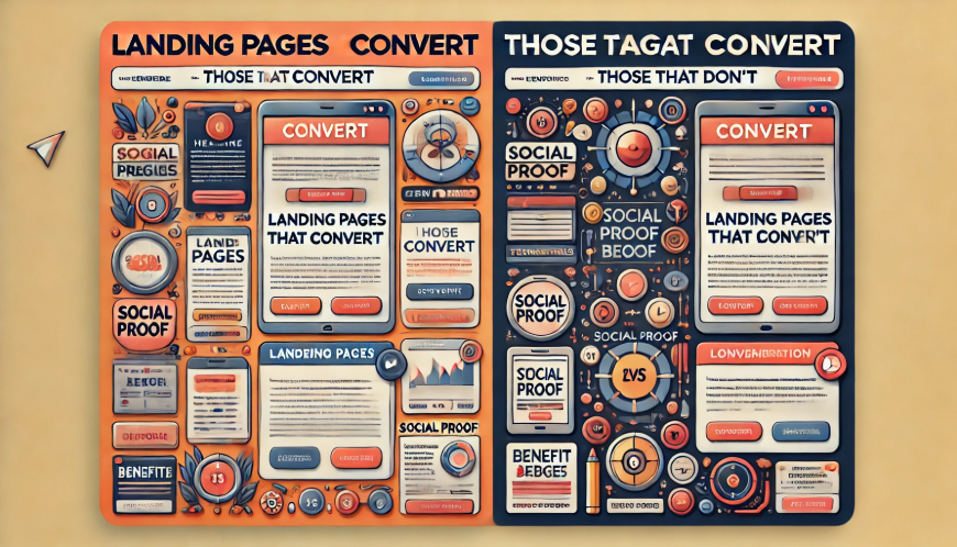
AI Generated Image
✅ Do: Keep It Focused and Distraction-Free
A high-converting landing page is simple and to the point. If visitors land on your page and see too much going on, they’ll get distracted and leave.
🔹 What works:
✔ A clear headline that instantly explains the value
✔ One primary call-to-action (CTA) – no competing links
✔ Easy-to-scan sections with short paragraphs and bullet points
🚀 Example of a focused landing page headline:
“Grow Your Business with High-Converting Website Copy – Get a Free Consultation Today!”
🛑 What NOT to do:
“Welcome to Our Website! We Offer Digital Solutions, Marketing Services, Copywriting, Web Design, SEO, and More – Learn About Our Company’s Mission Below.”
See the issue? Too many messages. Keep it clear and laser-focused on the action you want visitors to take.
❌ Don’t: Overload with Too Many Choices
Decision fatigue is real. If your landing page asks visitors to do too many things, they’ll likely do nothing at all.
🔻 Common mistakes:
- Multiple CTAs leading to different pages
- Too much text that overwhelms readers
- No clear visual hierarchy (everything fights for attention)
💡 How to simplify:
✔ Stick to one primary CTA (e.g., “Download Now” or “Book a Demo”)
✔ Remove unnecessary navigation links that could lead visitors away
✔ Use whitespace and bold text to make key points stand out
🔹 Before (Too Many Choices):
“Sign up for our newsletter, check out our blog, follow us on social media, or book a free consultation!”
✅ After (One Clear CTA):
“Get expert marketing advice delivered to your inbox—Sign Up for Our Free Newsletter!”
Less confusion = more conversions.
✅ Do: Use Persuasive, Benefit-Driven Copy
Landing page visitors don’t care about features—they care about benefits. Show them exactly how your product or service improves their life.
✔ Great landing page copy focuses on:
- What problem your product solves
- Why it’s better than alternatives
- How it makes the visitor’s life easier
🔥 Example of benefit-driven copy:
“Struggling with slow sales? Our marketing strategy helps you double your revenue in 90 days—without spending a fortune on ads.”
🚨 What NOT to do:
“We provide digital marketing solutions tailored to various industries with scalable and results-driven approaches.”
Which one feels more compelling?
❌ Don’t: Use Weak or Generic CTAs
Your CTA should be clear, action-packed, and impossible to ignore. If it’s too generic, visitors won’t feel compelled to click.
👎 Weak CTA Examples:
- “Submit”
- “Click Here”
- “Learn More”
🔥 Strong, high-converting CTAs:
- “Start Your Free Trial Today”
- “Get Instant Access”
- “Join 10,000+ Happy Customers – Sign Up Now”
Make visitors feel like they’re missing out if they don’t take action!
✅ Do: Build Trust with Social Proof
People trust real results, not just promises. Adding testimonials, reviews, or trust badges can dramatically boost conversions.
👥 What builds trust:
✔ Customer testimonials with real names & photos
✔ Case studies showing measurable success
✔ Media logos (“As Seen In Forbes, TechCrunch, etc.”)
| High-Trust Landing Page | Low-Trust Landing Page |
| ⭐ Customer reviews & ratings | ❌ No proof of credibility |
| 📊 Case studies with results | ❌ Generic claims with no evidence |
| 🔒 Security badges & guarantees | ❌ No mention of privacy or security |
If people trust you, they’re more likely to take action.
A landing page that converts is clear, persuasive, and focused on the visitor’s needs. Remove distractions, highlight benefits, and add trust-building elements. Want more website copywriting examples? Keep reading—there’s plenty more to learn! 🚀
Common Website Copy Mistakes and How to Fix Them
Website copy can make or break your online presence. Strong, clear messaging turns visitors into customers, while weak, confusing copy sends them running. Even the best businesses make copy mistakes that hurt conversions.
Let’s explore the most common website copywriting mistakes—and how to fix them with practical website copywriting examples.
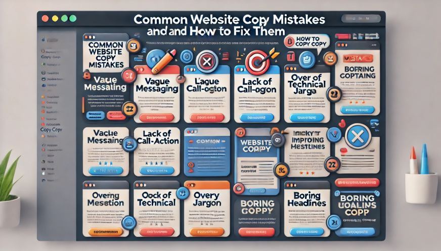
AI Generated Image
❌ Mistake #1: Writing for Yourself, Not Your Audience
Your website isn’t about you—it’s about your visitors. If your copy is full of “we” and “our company,” you’re missing the mark. Visitors don’t care about your achievements; they want to know how you can help them.
🔻 What hurts engagement:
- Too much company history and not enough customer benefits
- Industry jargon that confuses readers
- Focusing on features instead of solutions
💡 How to fix it:
✔ Use “you” more than “we”
✔ Highlight the reader’s pain points and how you solve them
✔ Keep it conversational and relatable
🚀 Before (self-focused copy):
“We have been in business since 2010, providing high-quality marketing solutions to brands worldwide.”
✅ After (customer-focused copy):
“Struggling to get more leads? Our marketing strategies help businesses like yours attract and convert customers—without the guesswork.”
See the difference? One talks at the reader, while the other speaks to them.
❌ Mistake #2: Weak or Vague Headlines
Your headline is the first thing visitors see. If it’s generic or unclear, they won’t stick around to read more.
🔻 What makes headlines ineffective?
- Using generic phrases like “Welcome to Our Website”
- Writing long, complicated headlines
- Failing to convey a clear benefit
💡 How to fix it:
✔ Keep it short, clear, and compelling
✔ Highlight the main benefit upfront
✔ Use power words to grab attention
🔥 Example of a weak vs. strong headline:
| ❌ Weak Headline | ✅ Strong Headline |
| “Our Company’s Services” | “Get More Sales with High-Converting Website Copy” |
| “Quality Solutions for Businesses” | “Boost Your Business with Copy That Sells—Fast!” |
A great headline makes visitors want to keep reading!
❌ Mistake #3: No Clear Call-to-Action (CTA)
Visitors won’t take action if they don’t know what to do next. A weak CTA—or worse, no CTA at all—means lost opportunities.
🔻 What kills conversions?
- Generic CTAs like “Click Here” or “Submit”
- Hiding the CTA in a wall of text
- Giving too many options, leading to decision paralysis
💡 How to fix it:
✔ Make the CTA bold, clear, and action-driven
✔ Use strong, persuasive language
✔ Keep it singular—one clear action per page
🔥 Examples of better CTAs:
- Weak CTA: “Learn More” → Strong CTA: “Get Your Free Strategy Call Now!”
- Weak CTA: “Sign Up” → Strong CTA: “Join 10,000+ Marketers—Sign Up for Free!”
Your CTA should make visitors excited to take the next step!
❌ Mistake #4: Overcomplicated Copy That’s Hard to Read
Nobody wants to read long, boring paragraphs filled with big words and technical jargon. If your copy feels like a textbook, people will bounce.
🔻 Common readability mistakes:
- Using long, complex sentences
- Writing huge walls of text without breaks
- Overloading with technical terms
💡 How to fix it:
✔ Use short sentences and simple words
✔ Break up text with headings, bullet points, and images
✔ Write like you’re talking to a friend—keep it natural
🚀 Before (hard-to-read copy):
“Our state-of-the-art, results-driven, multi-channel marketing solutions facilitate scalable business growth through data-backed strategies and innovative methodologies.”
✅ After (easy-to-read copy):
“We help businesses grow with marketing that actually works—backed by data, driven by results.”
Less fluff, more clarity!
❌ Mistake #5: Forgetting to Add Social Proof
Even the best-written website copy won’t convert if visitors don’t trust you. Social proof—like testimonials, reviews, and case studies—helps build credibility.
🔻 What makes a website feel untrustworthy?
- No customer testimonials or reviews
- No proof of results (case studies, stats, awards)
- Generic claims without evidence
💡 How to fix it:
✔ Add real testimonials from happy customers
✔ Showcase logos of trusted brands you’ve worked with
✔ Highlight numbers and results to back up your claims
🔥 Before (no social proof):
“Our clients love our services!”
✅ After (with social proof):
“Trusted by 500+ businesses worldwide. ‘Their strategy doubled our sales in three months!’ – Jane D., CEO of BrightTech.”
People trust people, not just promises!
Fixing these website copy mistakes can dramatically improve conversions. Keep it clear, compelling, and customer-focused, and don’t forget a strong CTA! Want more website copywriting examples? Keep reading—there’s plenty more to learn! 🚀
Conclusion
Crafting compelling website copy isn’t just about words—it’s about creating an experience that engages, persuades, and converts. The right messaging makes visitors feel understood, builds trust, and guides them toward action.
By learning from strong website copywriting examples, you can transform your site into a powerful sales tool.
Need expert help with your copy? Visit Riggz Digital for high-converting content that gets results! 🚀