
In the fast-paced world of digital analytics, Google Analytics heatmaps have emerged as a powerful visualization tool that transforms complex user behavior data into actionable insights.
While many marketers use basic heatmap functionality, few tap into the advanced features that can dramatically improve conversion rates and user experience. This guide dives deep into the hidden capabilities of Google Analytics heatmap tools that most professionals overlook.
Ready to move beyond surface-level analysis? We’ll explore five game-changing Google Analytics heatmap features that can revolutionize how you interpret user interactions, from advanced segmentation techniques to combining heatmap data with conversion funnels.
These powerful yet underutilized tools will help you uncover patterns that basic analytics miss, giving you a competitive edge in optimizing your digital presence.
Table of Contents
Understanding the Core Functionality of Google Analytics Heatmap Tools
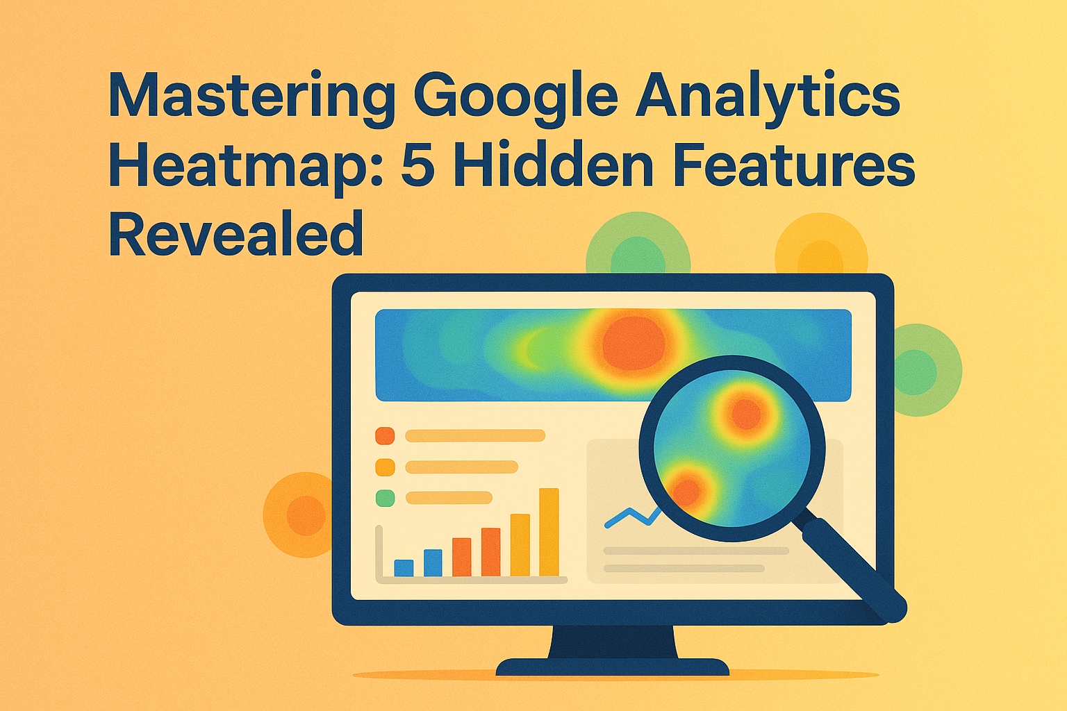
Google Analytics heatmaps transform complex data into colorful visual representations of user behavior on your website. Think of them as thermal images showing where users focus their attention.
These powerful tools reveal which elements attract clicks, how far visitors scroll, and where they spend the most time. You’ll discover patterns that numbers alone could never show you. The vibrant color overlays make it easy to spot hotspots of activity at a glance. Red areas indicate high engagement, while blue shows lower interaction zones.
What Exactly IS a Google Analytics Heatmap? 🔍
A Google Analytics heatmap is a visual data representation that uses colors to show user interaction intensity. You can see exactly where visitors click, move their cursor, or scroll on your pages. The warmer the color (red, orange), the more intense the interaction in that area.
Different heatmap types serve different purposes in your analytics toolkit:
- Click heatmaps show where users are clicking or tapping
- Scroll heatmaps reveal how far down your page visitors typically scroll
- Movement heatmaps track where users move their cursors (often indicating attention)
- Attention heatmaps combine various metrics to show overall engagement areas
The beauty of Google Analytics heatmaps lies in their simplicity. You don’t need to be a data scientist to understand what’s happening on your website. The visual format makes insights accessible to everyone on your team.
Setting Up Your First Google Analytics Heatmap 🚀
Getting started with Google Analytics heatmaps is easier than you might think. You’ll need to connect Google Analytics to a compatible heatmap tool since GA doesn’t offer native heatmap functionality.
Popular options that integrate with Google Analytics include:
| Tool | Key Feature | Integration Difficulty |
| Hotjar | Session recordings | Easy |
| Crazy Egg | Scroll mapping | Moderate |
| Mouseflow | Form analytics | Easy |
| FullStory | Rage click detection | Moderate |
Once connected, you can select specific pages to analyze. Your dashboard will display colorful heatmaps within hours or days, depending on your traffic volume. You’ll want to collect enough data for statistically significant results.
Setting goals before diving in helps focus your analysis. Are you looking to improve button clicks? Reduce form abandonment? Increase content engagement? The answers guide which heatmap types matter most.
Interpreting Your Google Analytics Heatmap Data 📊
Reading heatmaps effectively requires understanding what different patterns typically mean. You’ll become better at interpretation with practice.
Interesting patterns to watch for include:
- Click clusters away from clickable elements (users expecting functionality that isn’t there)
- Dead zones with minimal interaction (potential areas to remove or improve)
- Scroll abandonment points (where users stop scrolling, possibly missing key content)
- Distraction clicks on non-interactive elements (confusion in your interface)
The context matters tremendously when analyzing Google Analytics heatmap data. A high-click area might seem positive until you realize users are repeatedly clicking non-functional elements out of frustration.
Compare heatmaps across devices too. Your desktop and mobile users likely interact differently with your content. You might discover that mobile users miss important elements because they appear below the typical scroll depth.
Heatmaps shine when analyzed alongside other Google Analytics metrics. Combine them with bounce rates, time on page, and conversion data for deeper insights. This multi-dimensional approach helps you understand not just what users do, but potentially why they do it.
Remember that heatmaps capture aggregate behavior, not individual journeys. They show general trends across many users rather than specific paths. Use them to identify patterns worth investigating further with other analytics tools.
The colors on your Google Analytics heatmap tell stories about user experience. Areas that should attract attention but don’t might need redesign. Elements getting unintended focus might be distracting from your main conversion goals.
By understanding these core functions, you’re now ready to explore the more advanced features of Google Analytics heatmaps in the following sections.
Hidden Feature: Segmenting User Behavior with Custom Heatmap Filters
Most website owners use Google Analytics heatmaps to view overall user behavior, missing out on powerful segmentation capabilities. Dividing your heatmap data into specific user groups reveals insights that remain hidden in aggregated views. This hidden feature transforms basic heatmaps into strategic decision-making tools.
You can uncover dramatic differences in how various audience segments interact with your site. New visitors might focus on completely different elements than returning users. Mobile users often show entirely different behavior patterns compared to desktop visitors.
Segmentation Options You Didn’t Know Existed 🔍
Google Analytics heatmap segmentation goes far beyond basic device filtering. You can create custom segments based on numerous user attributes and behaviors:
- Traffic source segments (social media, direct, organic search)
- Geographic segments (country, city, region)
- Behavioral segments (new vs returning, conversion completers)
- Custom dimension segments (logged-in status, subscription level)
The magic happens when you compare these segments side-by-side. You might discover that social media visitors focus on images while search visitors gravitate toward text content. These insights enable you to tailor page elements for different traffic sources.
Setting Up Custom Heatmap Filters 🛠️
Creating segmented heatmaps requires connecting your Google Analytics data with your heatmap tool. Most popular heatmap solutions offer integration options that allow filtering by GA segments.
Here’s a quick guide to setting up custom filters:
| Step | Action | Benefit |
| 1 | Create segments in Google Analytics | Define specific user groups |
| 2 | Connect GA to your heatmap tool | Enable data sharing between platforms |
| 3 | Apply segments as filters | See heatmaps for specific user groups |
| 4 | Compare multiple segments | Identify behavioral differences |
You’ll want to ensure sufficient data volume for each segment. Smaller segments might require longer collection periods for statistical significance. Patience pays off with more reliable insights!
Using Segmented Heatmap Data to Drive Decisions 📊
Segmented Google Analytics heatmaps reveal opportunities for targeted optimizations across your site. You can customize experiences based on where users come from and what they care about.
Some powerful applications include:
- Creating different hero images for social versus search traffic
- Adjusting mobile layouts based on touch heatmap patterns
- Simplifying navigation for new users while expanding options for returning visitors
- Tailoring product recommendations based on geographic heatmap differences
This segmentation approach transforms your Google Analytics heatmap from a general visualization tool into a precision instrument. Each user group gets an experience optimized for their specific behaviors and preferences.
The competitive advantage comes from seeing what competitors miss. While they make general improvements, you can fine-tune each element for specific audience segments. This targeted approach typically yields much higher conversion improvements.
Unlocking Advanced Scroll Depth Analysis in Google Analytics Heatmaps
Scroll depth heatmaps in Google Analytics reveal crucial insights about how far users explore your content. Many website owners check basic scroll metrics but miss the advanced analysis opportunities. Your content effectiveness depends largely on whether visitors actually see it.
Discovering exactly where users abandon your page can transform your content strategy completely. The colorful visualization of scroll depth makes it easy to spot dropout points at a glance.
Beyond Basic Scroll Percentages 📜
Google Analytics heatmap tools offer much more than simple percentage-based scroll tracking. You can uncover advanced insights about user engagement with your content:
- Content visibility analysis (which specific elements users actually see)
- Attention threshold mapping (how long users view different sections)
- Scroll speed patterns (where users slow down or speed up)
- Scroll-to-click correlation (which viewable elements earn interactions)
These metrics help you understand not just how far users scroll, but how they engage with content at different depths. Slow scrolling often indicates high interest, while rapid scrolling suggests users are searching for specific information.
Setting Up Advanced Scroll Tracking 🔍
Maximizing your Google Analytics heatmap scroll insights requires proper configuration. Most basic setups track only percentage-based scrolling, missing valuable element-level data.
Follow this approach for more meaningful scroll analysis:
| Feature | Implementation | Benefits |
| Element visibility tracking | Add specific elements to track | See if important CTAs are viewed |
| Time-to-scroll metrics | Enable timing features | Understand how quickly users reach key content |
| Scroll velocity tracking | Activate advanced settings | Identify skimming versus reading behavior |
| Exit point correlation | Connect with exit analytics | Discover where frustrated users leave |
You can typically access these features through the advanced settings in your Google Analytics heatmap tool. The extra setup time yields much richer insights than default configurations.
Actionable Insights From Scroll Depth Analysis 🚀
Google Analytics heatmap scroll data becomes truly valuable when translated into specific website improvements:
- Move important content above identified drop-off points
- Redesign sections with high abandonment rates
- Add engaging elements in “ghost town” areas with low engagement
- Create visual hooks at strategic depths to pull users further down
- Shorten pages where users rarely reach the bottom content
Pay special attention to the relationship between scroll depth and conversion elements. Your call-to-action button might get plenty of views but few clicks, suggesting a messaging problem rather than a visibility issue.
Consider testing different content arrangements based on your scroll heatmap findings. Moving key information higher often produces dramatic improvements in engagement metrics.
The most valuable approach combines scroll heatmaps with user recordings. Seeing exactly how real users interact with your content provides context for the patterns visible in your Google Analytics heatmap data.
Remember that mobile and desktop scroll patterns typically differ significantly. Mobile users often scroll further but engage less deeply with content, requiring different optimization strategies for each device type.
Combining Heatmap Data with Conversion Funnels for Actionable Insights
Google Analytics heatmaps become exponentially more powerful when combined with conversion funnel data. These two tools together reveal not just what users do, but how their actions relate to successful conversions. Your optimization efforts gain precision when guided by this combined approach.
Connecting behavior patterns from heatmaps with conversion outcomes provides context for user interactions. The colorful visualization of clicks makes sense when you know which patterns lead to conversions.
Mapping Behavior to Conversion Stages 🔄
Google Analytics heatmap data gains new meaning when overlaid with funnel stage information. You can identify which interactions propel users forward and which create dead ends:
- Entry point interactions (first clicks that start successful journeys)
- Progression clicks (interactions that typically move users to next stages)
- Diversion points (clicks that commonly lead users off the conversion path)
- Final conversion triggers (last interactions before conversion completion)
This approach transforms isolated heatmap data into journey-based insights. Certain click patterns might appear identical but lead to dramatically different conversion outcomes depending on context.
Setting Up Integrated Analysis 📊
Creating this powerful combined view requires connecting your Google Analytics heatmap tool with funnel tracking capabilities. Most platforms offer integration options that make this process straightforward.
Follow these steps for effective integration:
| Step | Action | Outcome |
| 1 | Define clear conversion funnels in Google Analytics | Establish measurement framework |
| 2 | Enable cross-platform data sharing | Connect behavior and outcome data |
| 3 | Create segment-based heatmaps | View behaviors by conversion success/failure |
| 4 | Set up side-by-side comparison views | Analyze differences between converters/non-converters |
The setup might seem technical at first, but the insights gained justify the initial investment. Your marketing decisions become data-driven rather than based on assumptions.
Finding Hidden Conversion Blockers 🕵️♀️
The magic happens when you compare Google Analytics heatmaps between converters and non-converters. Subtle differences often reveal major optimization opportunities:
- Converters might navigate directly to key information while non-converters wander
- Successful users might interact with specific elements that others ignore
- Non-converters often click on non-functional elements out of confusion
- Abandonment typically happens at specific friction points visible in heatmaps
These insights let you systematically remove conversion barriers from your website. You might discover that minor design elements create major confusion for potential customers.
Consider creating dedicated landing pages based on these insights.
Different traffic sources often show different heatmap patterns leading to conversions, suggesting customized approaches work better than one-size-fits-all.
The most valuable improvements often come from seemingly small details revealed through this combined analysis. A slightly confusing form field or misleading button might create massive conversion drops visible only through Google Analytics heatmap and funnel integration.
Exporting and Sharing Google Analytics Heatmap Reports Effectively
Great Google Analytics heatmap insights deserve to be shared with stakeholders who can implement changes. Even the most revealing heatmap data goes to waste if kept isolated within the analytics team.
Your ability to export and present these visual insights effectively can dramatically increase their impact.
Compelling heatmap presentations turn complex user behavior data into clear action items for various teams. The right sharing approach makes technical data accessible to non-technical stakeholders.
Creating Stakeholder-Specific Heatmap Reports 📋
Google Analytics heatmap data needs different framing depending on who receives the information. Tailoring your exports to specific audiences increases their effectiveness:
- Executive reports focus on conversion impact and ROI implications
- Design team reports highlight specific UI elements and interaction patterns
- Content team reports emphasize scroll depth and engagement metrics
- Developer reports include technical implementation details and bug indicators
Consider creating custom report templates for recurring stakeholder presentations. This consistent format helps recipients quickly understand new findings against previous benchmarks.
Export Options Beyond Basic Screenshots 🖼️
Google Analytics heatmap tools offer sophisticated export capabilities that many users overlook. These options create more valuable deliverables:
| Export Type | Best For | Key Benefit |
| Interactive HTML reports | Detailed exploration | Recipients can interact with the data |
| Video recordings | Demonstrating user flows | Shows behavior in context |
| Comparative side-by-sides | Before/after analysis | Visualizes improvements clearly |
| Data-enriched PDFs | Formal presentations | Combines visuals with metrics |
You might need different export formats for different communication channels. Interactive reports work well for detailed team discussions, while executive summaries benefit from concise visual highlights.
Communicating Actionable Insights Effectively 🚀
The presentation of your Google Analytics heatmap data significantly impacts how likely others are to act on it. Follow these principles for maximum effectiveness:
- Pair each heatmap visual with a clear, specific recommendation
- Quantify potential benefits whenever possible (“could increase conversions by approximately 15%”)
- Highlight priority fixes based on impact versus implementation difficulty
- Provide before/after examples when showcasing successful changes
- Create regular update schedules to maintain momentum
Consider creating a dedicated Slack channel or email digest for sharing ongoing heatmap insights. Regular updates keep optimization efforts top-of-mind across teams.
The most effective approach combines heatmap visuals with supporting analytics data. Adding conversion metrics, bounce rates, or revenue figures to your heatmap presentations connects user behavior to business outcomes.
Remember that different stakeholders respond to different motivators. Technical teams appreciate detailed interaction data, while management responds better to business impact metrics connected to the heatmap visuals.